Role: Lead Product Designer (Design Operations & Behavioral Design)
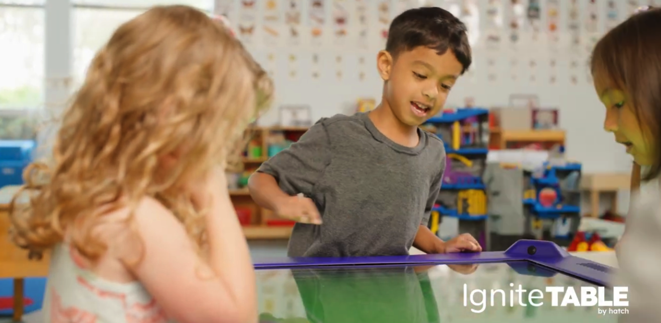
Platform: Large-format multi-touch table (1 to 4 Simultaneous Users)
User Personas: Dual-User (Pre-K Students & Teachers)
Tools: Adobe Creative Cloud, Jira, Confluence
Innovations: Anthropometric UX for early learners and educators; scalable system for high-velocity content production.
Strategic Outcome: I led the end-to-end design and delivery of a 360° interface and 60+ games within an 8-month timeline, establishing a critical hardware component of the $25M+ Ignite ecosystem.
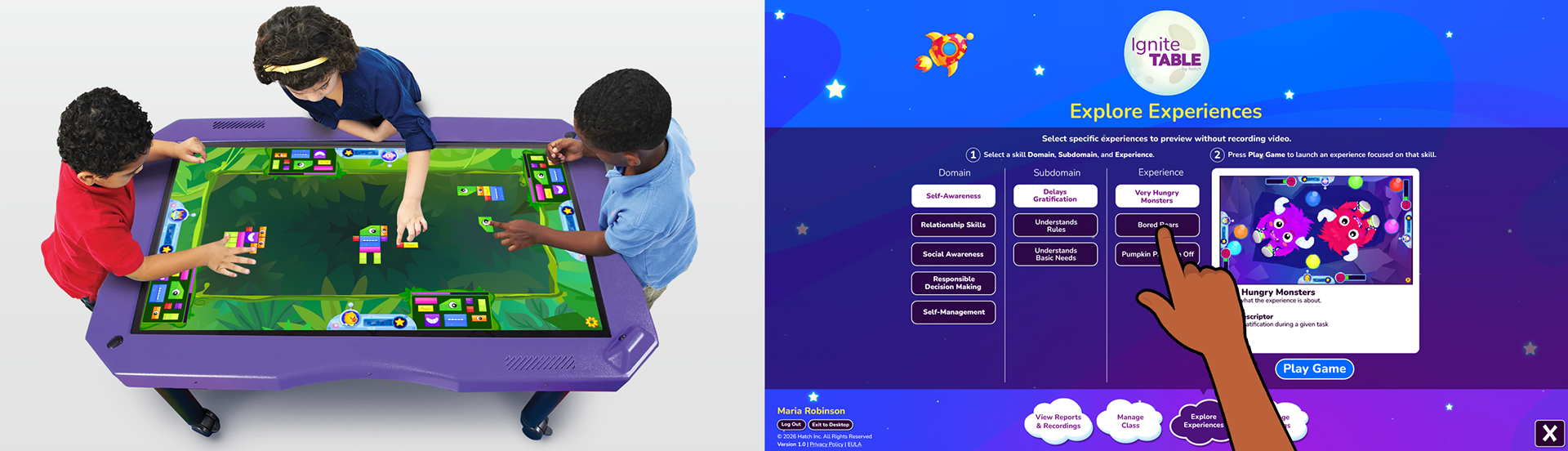
Dual-User UX: (Left) Children playing from different sides of the table; (Right) A linear teacher interface.
The Challenge
A High-Risk Technical Sunset: The existing product had considerable technical debt, including a deprecated Flash architecture, and an 8-month sunset loomed because the plugin we relied on to keep it working was no longer viable. The product also had limited engagement, offering only a few game types and lacking an overarching reward system. I was tasked with leading the end-to-end UX/UI transformation of this legacy product into a modern SaaS framework.
The Goal: Create a 360°, equitable, collaborative play interface, along with 66 games that foster social-emotional learning for preschoolers, and an efficient, ergonomic classroom management interface for teachers, all within the 8-month timeline.
Child Play Mode (360° Interaction)
Orientation-Agnostic Design: Since children could stand on all four sides, it was key that each child had an equitable experience, even if they were on one of the shorter sides of the table. To this end, we designed all UI elements to be the same size, regardless of their position on the table, and we ensured that the perspective used did not favor any child over another.
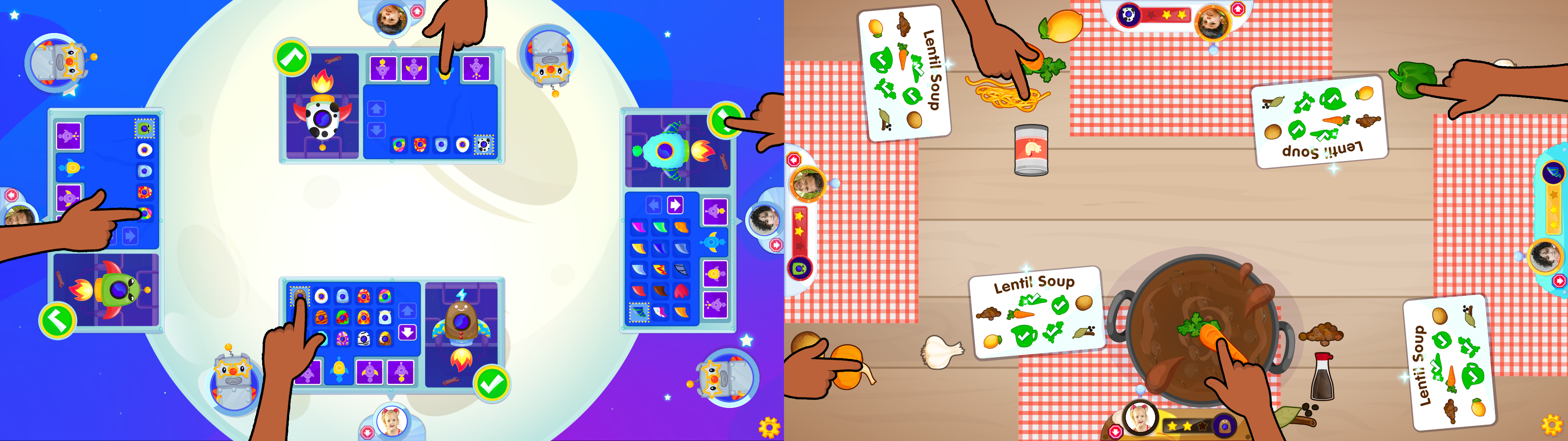
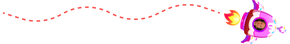
Orientation-Agnostic Design: (Left) Rocket customization UI; (Right) Collaborative play game UI
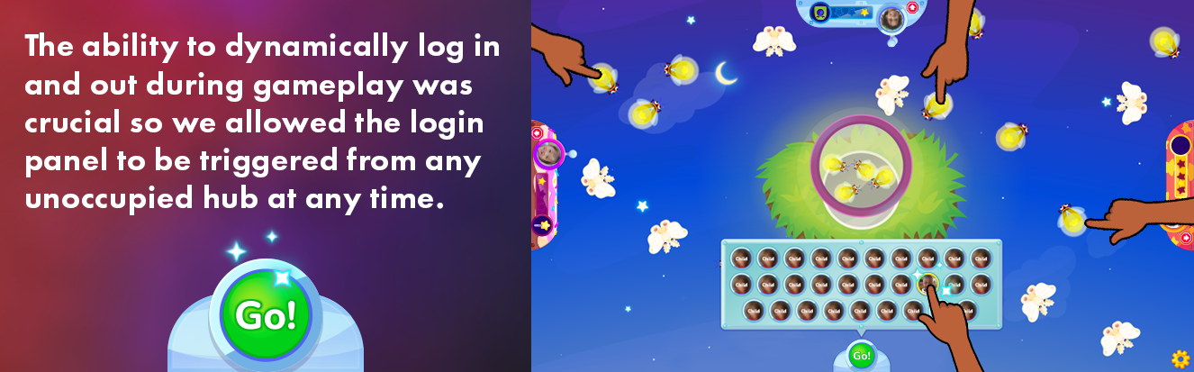
Stationary Child Anchoring: Two recurring problems during early testing were that children would sometimes move to different sides of the table during play or wander off without logging out, and a new child would take their place. This compromised the data the product captured, undermining its value proposition.
To keep children on the side of the table where they logged in and to encourage them to log out when they finished playing, I leaned on principles of behavioral design. I tied children's hubs directly to the product's overarching extrinsic reward system, Rocket Customization. The hubs included their photo, a skin that matched their current rocket customization, and the next rocket part they were working toward earning through play, establishing a sense that the hub was their special place. These elements, within each child's clear line of sight and reach, helped maintain their focus on their personal "zone."
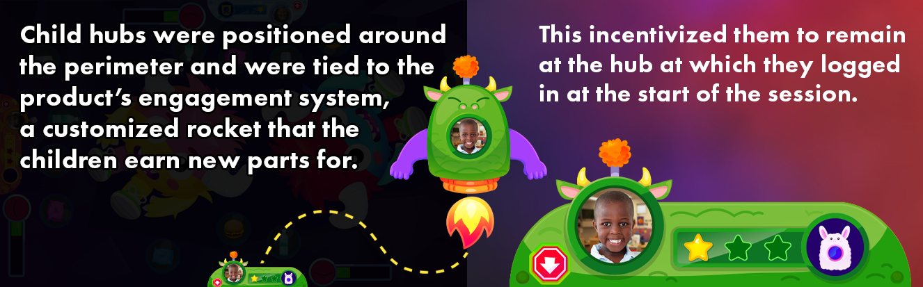
Behavioral Design: To keep children at their hubs, I applied principles such as the Endowment Effect and the Goal-Gradient Effect.
Collaborative Logic (Social-Emotional UX): Each of the 60+ games in the initial launch was designed to meet its skill's pedagogical requirements. Each mechanic used required a consideration of a preschooler's height and arm length to determine placement, acceptance areas, etc.
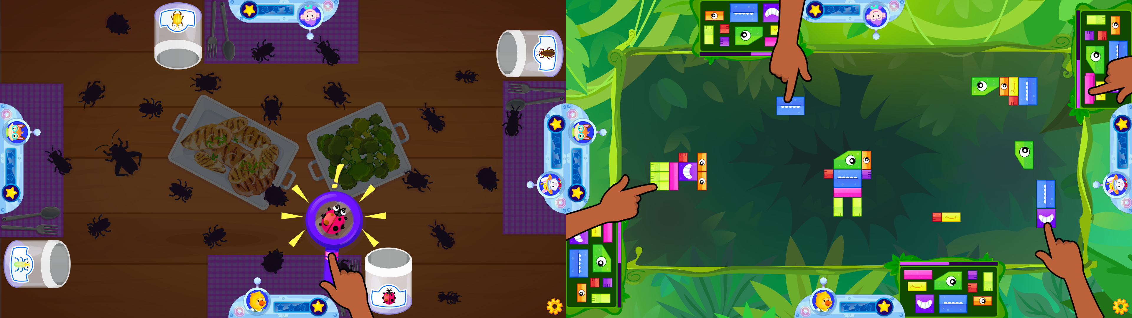
Diverse Mechanics: (Left) Children share a magnifying glass to reveal bugs; (Right) Children drag creature blocks from near their hubs to a collaborative space in the middle where their creations can connect.
Each game also had to handle children dynamically logging in and out during gameplay, along with other considerations, including what to do when a child became distracted and held up the game. What was the best moment in that game to trigger video recording to produce the most valuable work sample for teacher rating?
I was responsible for writing the technical specifications for each game in Jira tickets. I considered each situation carefully to answer these questions and guarantee consistent behavior throughout the product.
Teacher Tools (Anthropometric & Reach-First Design)
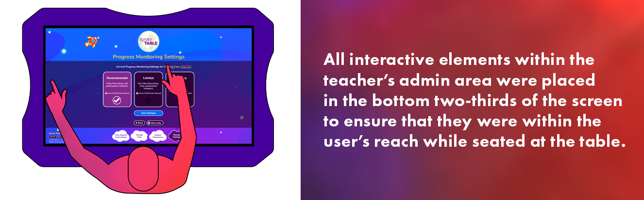
The Problem: Traditional software layouts fail on a 43-inch horizontal surface. Standard navigation at the top of a screen is physically out of reach for an adult sitting at the table's edge, causing fatigue.
The Solution: I positioned all interactive elements within the bottom two-thirds of the screen. This kept all touch targets within the natural reach of seated educators.
Design Consistency & Transferrable Skills
An Opportunity: The multi-touch table product was intended to integrate with the company's existing EdTech ecosystem, most notably its flagship SaaS Android/iOS/Windows tablet. It was anticipated that there would be significant crossover between the users of the two products.
To lower the learning curve for both users, I used a shared visual language. I implemented established UI patterns from the tablet product in the multi-touch table experience for children and educators. It was a bonus that these patterns had already proven successful in the tablet product.
Cognitive Demand Reduction: By using familiar interactions, such as the method for accessing the Teacher Area, I ensured that tablet product users could quickly begin using the new product without additional training.
Unified Interaction Patterns: To ensure device-agnostic mastery, I carried over established UI signifiers, such as the "green check" task-completion button, from the flagship tablet product. This reinforced a persistent sense of agency and accomplishment, allowing children to transfer their existing interface knowledge directly into the touch-table environment.
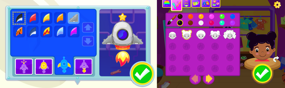
Unified Interaction Patterns: The rocket workshop (Left) on the table uses the same method for saving customizations as the "Dressing Room" (Right) in the tablet product within the same product suite.
The Impact
Beyond the hardware-specific design, I built a UX framework that allowed our team to deliver 66 games, transition and intro animations, a reward system with hundreds of earnable rewards, and a teacher admin panel within our 8-month timeline, with minimal design debt.
Operational Improvement: By implementing the same automated Jira workflows and ticket templates used across the whole product suite, I enabled our lean team to deliver 66 games and a teacher admin panel within an aggressive 8-month window, while sustaining a 30% increase in production speed.
Strategic Platform Modernization: I led the UX migration of the legacy Flash-based product to a modern, SaaS architecture. Collaborating tightly with the Product Owner and subject matter experts, my team created a library of 60+ highly engaging games aligned with a respected current SEL framework. It implemented an overarching reward system to address engagement and "wandering" issues observed in the previous product.
Reflections
Physical Context: This project reinforced that UX is as much about human factors and ergonomics as it is about pixels. Our success was rooted in early, low-fi A/B tests that showed that standard UI placement would cause fatigue and frustration on horizontal hardware. Digging into all sorts of anthropometric data to inform these decisions was a ton of fun to geek out on.
The Need for Validation: While we met our 8-month timeline, it required a design-heavy front end that didn't allow for much prototyping. I would have loved to implement iterative testing cycles throughout the entire production phase rather than relying on early-stage validation. Having more frequent gut checks with preschoolers along the way would undoubtedly have led to more refined mechanics in the finished product.